Overview
Group industry project undertaken for the company Svalna focused on developing a comparison tool to enhance environmental sustainability through emissions benchmarking.
Svalna, a greentech innovator, develops solutions for estimating climate footprints, supporting entities like universities and municipalities in emission management. Recognizing a demand among small to medium-sized companies for emission benchmarking, Svalna sought to enhance its platform to include comparison features. This project aimed to address this need by designing an interface that allows companies to easily compare their emissions with industry peers, facilitating insights and actions towards emission reduction. The goal was to provide Svalna with a design proposal, which they would then implement into their site, that enriches its platform with a comparison tool, enabling businesses to assess their environmental impact relative to similar companies.
Project specification
Client: Greentech start-up Svalna
Duration: 9 Weeks
Tools: Figma
Deliverables: Benchmark,
User surveys,
Interviews
, Persona,
Low-fidelity wireframes
, High-fidelity mockups
research
Our research phase encompassed online benchmarking and semi-structured interviews (n = 5) with Swedish professionals working in emissions management.
This dual approach helped us understand the landscape of sustainability data visualization and gather user needs. This data was then analysed with the help of affinity mapping revealing common themes and pain points.
findings and themes
We analyzed feedback from our research to identify key user preferences and challenges.
1. Enhanced accessibility in data visualization: Users seek visual representations that are both clear and intuitive, with a strong emphasis on accessibility for those with visual impairments. This feedback underscores the importance of creating visualizations that are easy for all users to interpret.
2. Integrated emissions information hub: There is a demand for a unified platform that consolidates various emissions data sources. Users desire a streamlined experience that eliminates the need to navigate multiple tools or pages, facilitating easier management and access to sustainability metrics.
3. Intuitive yet comprehensive interface: The ideal interface should strike a balance between simplicity and informational depth. Users appreciate a design that allows for easy navigation while also offering detailed, interactive insights to enhance understanding of emissions data.
4. Simplification of environmental information: Users advocate for the simplification of complex environmental data. Presenting this information in a straightforward, understandable manner is crucial for supporting informed decisions in sustainability initiatives.
persona and scenario
We crafted the persona of Kim, a 47-year-old HR professional passionate about sustainability, to anchor our design in real-world user needs
At the heart of our design process is Kim, a persona born from insights shared from Svalna and our research findings. Kim represents the target user for the comparison tool we're developing. This persona ensures our tool is accessible and engaging for users like Kim, facilitating an intuitive understanding and management of environmental data. Kim's scenario guides our design, emphasizing a tool that supports effective communication and inspires action within organizations.
Bio: Kim is a 47-year-old HR professional at Acme AB, embodying the target user for our emission comparison tool. With a dedication to sustainability but limited formal education in environmental studies, Kim's profile represents our primary user—keen on making a difference yet novice in climate data analysis.
Goals: Her role involves using our system to track emissions, set sustainability goals, and benchmark against peers.
Scenario: Faced with the task of motivating her company towards 2030 climate targets, Kim's needs underline our design focus: simplicity, clarity, and usability.

ideation
We brainstormed creative solutions focusing on innovative data visualization and user interaction.
Our design exploration kicked off with a Crazy 8 brainstorming session, generating 40 ideas focused on making data visualisation both interactive and easy to understand.
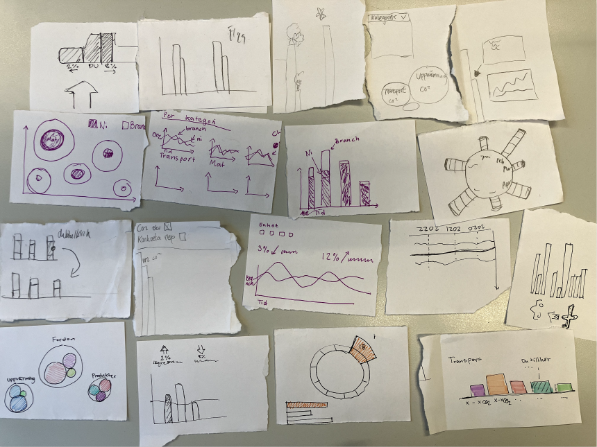

wireframing
We distilled our ideas into Figma wireframes for detailed testing.
Through discussion and refinement, we narrowed these ideas down, transitioning the most promising ones into wireframes in Figma. This step was crucial for visualising our concepts and making them tangible for further evaluation and testing.
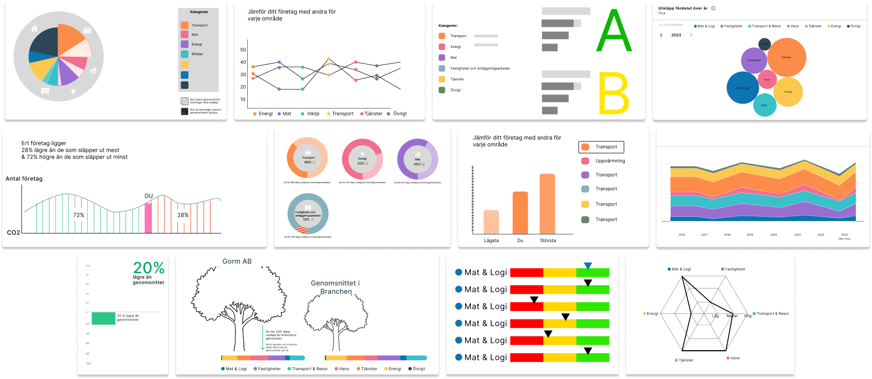
wireframing
We refined our initial design concepts against key criteria such as user-friendliness, clarity, and professional presentation.
Designs cluttered, confusing, or containing irrelevant data were discarded. Selected ideas were developed into higher fidelity frames in Figma, aligning with Svalna's design system for more precise A/B testing. Further user testing (n = 5) with company representatives informed the selection of the most effective visualizations that we would further develop.
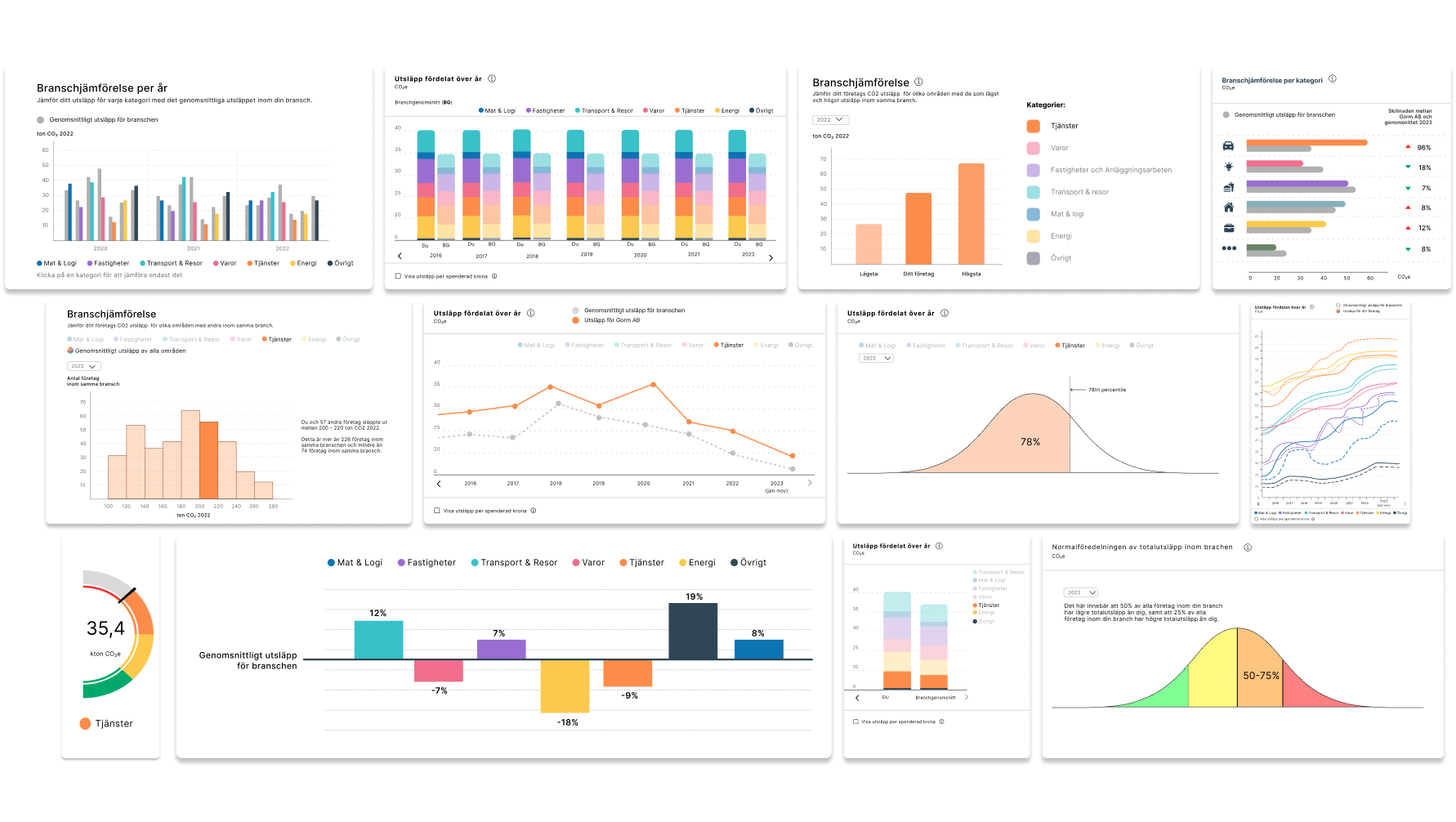
prototyping
We developed a high-fidelity prototype of the app to closely simulate the final user experience for further user tests.
The individual visualizations were now largely established, so we focused on refining a dashboard layout, experimenting with various graph combinations. High-fidelity prototypes created in Figma allowed for direct user interaction, and would lead to more effective testing. Further user testing (n = 4) pinpointed key areas for improvement: enhancing histogram readability, removing unnecessary summary cards and elements, and optimizing filter placements. These adjustments would be our focus for our final prototype and would significantly improve the dashboard's usability and effectiveness in displaying emissions data.
Final design
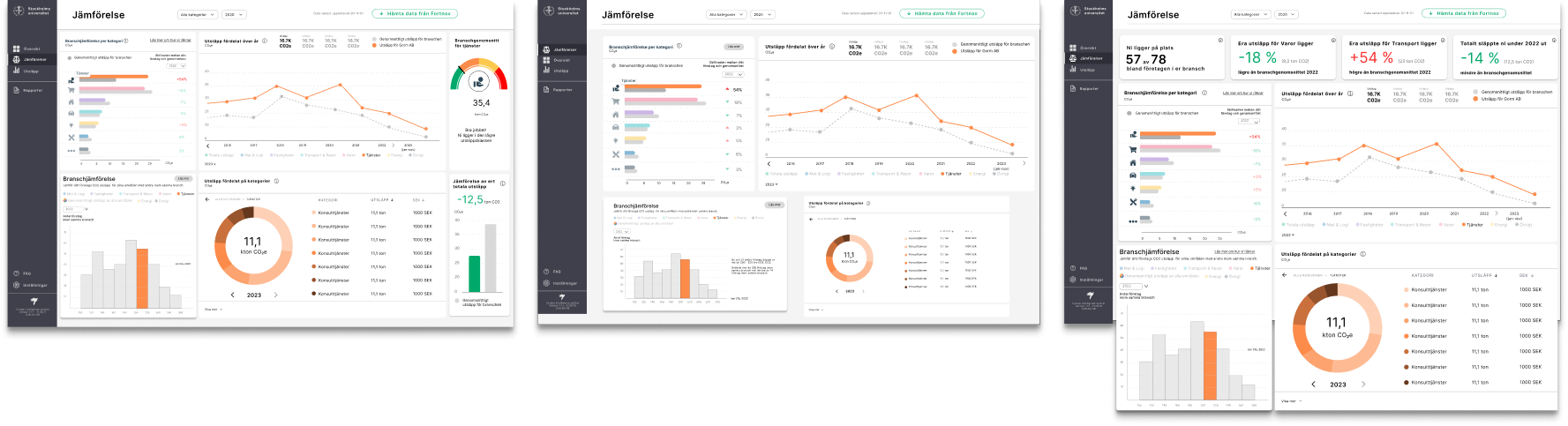
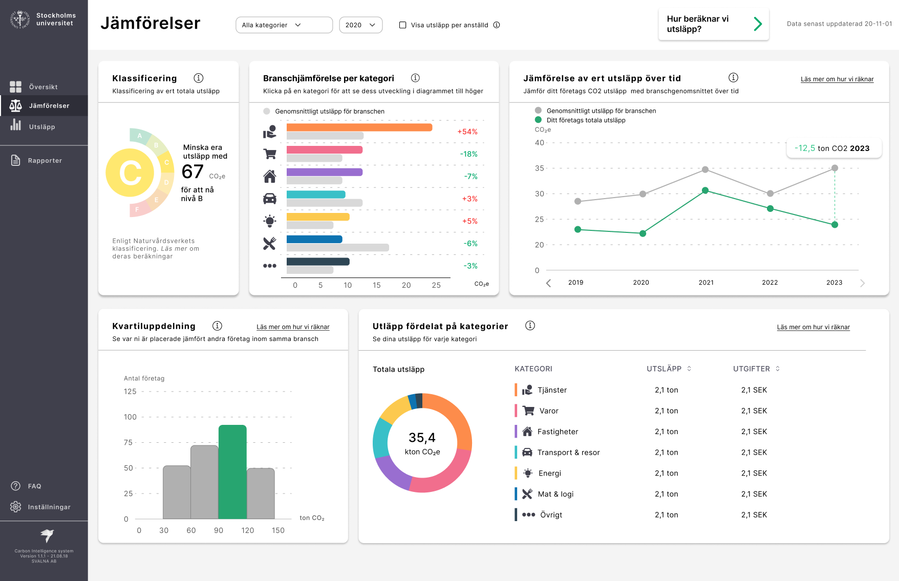
Our final prototype introduces a comprehensive, interactive dashboard designed to help businesses understand and reduce their environmental impact with the help of five interactive widgets.
Each widget provides unique insights into CO2 emissions, from an overview to detailed analyses by category. Enhanced interactivity allows users to delve into specific sectors like transport for deeper emission insights. For instance, selecting the "transport" category brings up granular details about emissions from that sector, encouraging users to explore and understand their environmental footprint more thoroughly. In response to feedback from our user tests, we streamlined the dashboard by removing unnecessary elements and integrating filters into the top navigation for improved usability. This dashboard emphasizes accessibility, clarity, and actionable insights, offering real-time visualizations that help businesses make sustainable decisions.
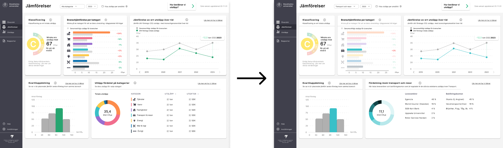
Dynamic design
Selecting a specific category in one widget dynamically updates four out of the five widgets on the dashboard, providing a comprehensive and focused breakdown of emissions within that category. This interconnected functionality allows users to delve into detailed insights about their company's climate impact in a specific area, and see how it compares to industry averages and standards. For example, when "Transport" is chosen, the dashboard adjusts to display relevant data across multiple widgets, offering an in-depth view of emissions, trends over time, and how these stack up against broader industry benchmarks.
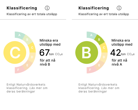
Classification widget
Gives a quick glance at the company's overall climate impact with a letter grade, inspired by energy declarations and standardized by authoritative sources for fair industry comparison.
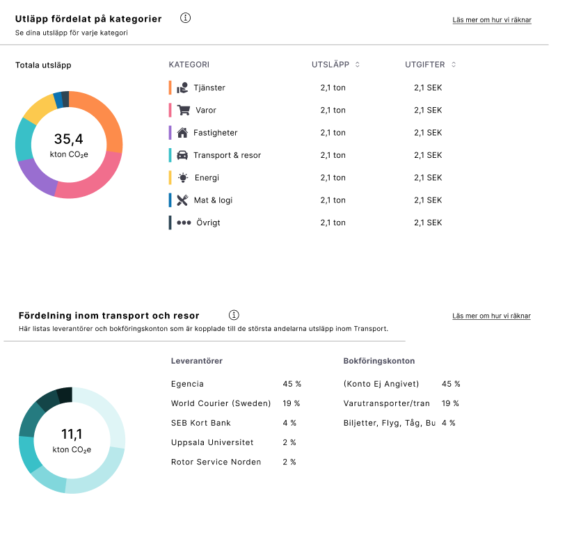
Emissions by Category
Details emissions in specific areas against industry averages, encouraging deeper exploration of environmental footprints.

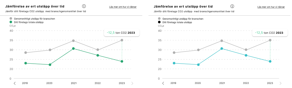
Emissions tracking over time
Displays the company's total emissions or a specific category over a timeline, offering insight into trends and patterns in the company's environmental footprint.
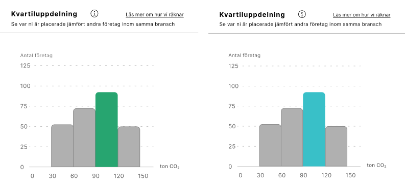
Position within industry
Details emissions in specific areas against industry averages, encouraging deeper exploration of environmental footprints.
Emissions per category
This widget displays the impact of each category on the company's total emissions and lets you drill down into more detailed subcategories. This breakdown helps identify significant emission sources and areas for improvement.
Future improvements
Looking ahead, there are clear opportunities for enhancing the project by diving deeper into relatable CO2 metrics and developing functionalities specific to various industries.
These areas, identified during the project but not fully explored due to time limitations, offer promising avenues for making the tool more relevant and impactful. Future iterations of this project will benefit from incorporating these insights, focusing on expanding the tool’s capabilities to meet the nuanced needs of different sectors.
Lessons learned
Throughout this project, we encountered challenges in balancing the creative aspects of design with the constraints of available data and ensuring practical feasibility for Svalna.
This experience taught us the critical importance of maintaining regular communication with our client, Svalna, to ensure that our creative ideations remained grounded in practicality and aligned with real-world applications. We also learned the significance of user feedback, which revealed a pressing need for clearer explanations of CO2 calculations and the desire for features tailored to specific industries. This feedback highlighted the necessity of focusing our design efforts on the needs of novice users rather than experts, ensuring our solutions are accessible and relevant to our primary audience.